As the UK’s official death toll from Covid-19 passed Italy’s for the first time, it is worth noting that one month ago, government sources were privately sceptical of a study by world-leading disease data analysts that projected the UK would be the worst-affected country in Europe. The study anticipated 66,000 deaths by August. The total figure on Tuesday, which is certain to be an underestimate, was already more than 32,000.
With Britain’s relative position appearing to worsen, the government’s attempt to shape the narrative at its daily Downing Street press briefing has become more significant – and the slideshow of charts presented by advisers have been at the heart of the story.
The slides have become a recognisable feature of the discussion but there has been little scrutiny of the data behind them – and how it can mislead rather than enlighten.
We can’t reliably compare Covid-19 deaths between countries
Dominic Raab said at Tuesday’s briefing that “we won’t get a real verdict on how countries have done until the pandemic is over”, and he was correct that comparisons were fraught with difficulty. Countries count deaths in different ways.
The UK and other governments have said that making inter-country comparisons was at best unhelpful. Statistician David Spiegelhalter went further, describing them as “deeply unreliable”, something underlined by the chief medical officer, Prof Chris Whitty, last week.
Despite this, the government continues to include a chart showing the total number of deaths per country – albeit with a disclaimer that “different countries have different methods of counting Covid-19 deaths which means it is difficult to compare statistics across countries”.
On 29 April, a new slide appeared on screen: global deaths per million population. Its inclusion allowed the government to say that, even after adding non-hospital deaths in England to its daily tally, the UK’s rate was below Belgium, Spain and Italy and almost in step with France.
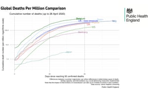
But the small print under the graphic proved important: “Differences between countries’ trajectories can reflect differences in determining cause of death, testing capacity, and interventions (eg social distancing measures) implemented.”
The devil was in the detail: the UK’s daily figures only included deaths where the patient tested positive for Covid-19. The Belgian figures included all suspected cases regardless of whether a test was carried out.
To indicate how this may skew things, here is a chart showing various countries’ position as per the data from that day’s briefing:
By this measure the Belgian death rate was the worst. But if we strip out nursing home deaths in the UK and Belgian, things look a lot different.
A total of 3,419 hospital deaths had been recorded in Belgium by 29 April, or 295 deaths per 1 million population. There were 22,286 hospital deaths in the UK recorded by the same day (excluding those who did not receive a positive test beforehand) or 328 deaths per 1 million population.
The deaths each government includes or excludes matter. France includes care home deaths in its total, whereas the UK only includes some care-home deaths as set out above. The way Spain and Italy count their figures is similar to the UK – deaths in Spain have to have had a positive test result before being included – but even then it is hard to say with certainty whether we are comparing like with like.
The daily death toll – reported hospital deaths versus date of death
The daily death toll figures released by the government are not an accurate reflection of the number of deaths in the UK.
Up to 28 April, the figures included only those hospital deaths where a patient had received a positive Covid-19 test. Since 29 April, the figures have included non-hospital deaths in England. Deaths in other settings in the devolved nations were already being counted in the daily government figure.
However, the requirement for a positive test still stands, meaning hundreds of deaths are missing from the daily toll.
There is confusion as to whether the government figures are per date of reported death or date of actual death – the figures fluctuate day by day which could be due to corrections to the daily totals, making it hard to be sure.
But regardless of which metrics are being used, the figures in the bar chart on the government’s screen each day – including its use of a seven-day rolling average – is still not a fair reflection of the current situation.

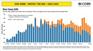
Number of cases: only as good as the number of tests taking place
The briefing also contains an update on the number of new coronavirus cases confirmed each day. During the 4 May press conference 3,985 new cases were confirmed by lab testing. Despite the nice bar graph, we have no idea how many cases there are in the UK.
Although testing capacity has increased substantially, the UK is nowhere near the widespread “test and trace” strategy recommended by the World Health Organization and followed by other countries such as Germany and South Korea.
The UK is expanding testing from hospital patients and NHS workers to key workers and, on Tuesday, to all symptomatic over 65s, those who need to go out to work, care home residents and staff. However, this still represents a small section of the population.